Updated
7/12/05
Color Settings
What is Color Management
RGB vs. CMYK
Gamut
Early Color Management
Color Management Systems
Current Color Management
Calibrate your
Monitor
|
|
Inside
WI
> BaRC >
Graphics > Photoshop
> Color Management
Color
Management
Color
Settings
If
color settings are set properly from the beginning, they can improve
color consistency between scanner and monitors, between different monitors,
and between monitors and printers. If they
are set incorrectly, they can cause irreversible damage to your image.
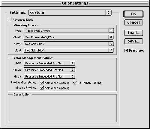
When you run Photoshop for the first time, it will ask you to set your
color settings. Please go to
Edit > Color Settings and
set them like this:
The
next step is to calibrate
your monitor. Otherwise you may not see
the advantages of this sophisticated system. It takes only 5 minutes.
What
is Color Management? ............Back
to top
Each
device we work with produces a slightly different range of color. Color
Management tries to keep files from different devices looking consistent
as the file moves from scanner, to monitor, to another monitor, to printer.
Although
Adobe's color management does a good job, it can't solve the problem
entirely. Some of the visual differences have to do with the difference
between making a color with light vs. making the same color with ink.
The ingredients going into the color are much different with light than
with ink. The two colors are made in 2 different color spaces. You can
think of a color space as a kitchen with limited ingredients. Color
Management is all about trying to make these different recipes come
out with the same result.
RGB
vs. CMYK
.............Back
to top
RGB
and CMYK are two different color spaces. The RGB
color space uses light in colors of red, green, and blue to create the
visible spectrum. Our eyes see color in terms of reflected light, so
in a way, the real world is in RGB. That is why RGB devices that use
light to create color, such as film recorders, scanners, and cameras
can reproduce color fairly accurately.
However, as soon as we try to take the image created by light and put
it on paper, we enter the realm of CMYK.
Cyan, magenta, yellow and black are the colors of ink we use to try
to reproduce the colors we see in nature. No matter which printer you
use, you are going to need ink, dye, toner, or some physical manifestation
of these colors. The ingredients used in the recipe limit accuracy in
the creation of a color, so there will always be a difference between
what you see on your monitor and what prints out.
 |
 |
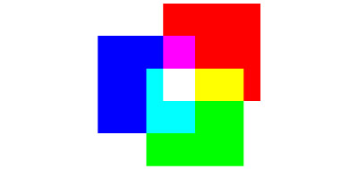
| RGB.
Three colors of light, red, green and blue make white light. (Also
make cyan, magenta and yellow). |
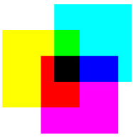
CMYK.
Three inks, cyan, magenta and yellow make black. In practice this
black is sometimes muddy-looking, so a separate black, K is usually
added. (red, green and blue are also made) |
Gamut
.............Back
to top
The
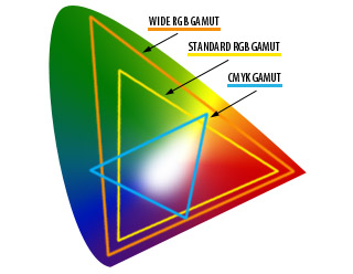
total range of colors able to be produced by a device is called its
gamut. The explanation above is usually summarized by saying that the
RGB gamut is larger than the CMYK gamut. Gamut applies to device capabilities,
but can also be applied to other components of the reproduction process.
For example, a given printer can reproduce a wider range of colors on
coated paper than it can on newsprint. Therefore, coated paper is said
to have a wider gamut than newsprint.
 |
Within
RGB and CMYK spaces, more variations in gamut exist. Monitors, for example,
have a much smaller gamut than slide film and high quality digital cameras,
which in turn have a much smaller gamut than what the human eye can
perceive. Between monitors, there are also differences in gamut dependent
on the phosphors and other hardware components used. Gamuts of printers
also vary so that even though they follow the same color recipe, they
often output slightly (or greatly) different results. Because of all
this, color is highly device-dependent.
Early
Color Management
.............Back
to top
In
view of the above, converting color from RGB to CMYK with much accuracy
and consistency as possible has been the focus of the printing industry.
Photoshop, as a major component of the printing process, has had to
address the issue as well. In previous versions of Photoshop, the RGB
values were always defined as those displayed by your monitor.
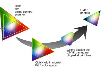
This
was simpler, but the RGB values in an image were "clipped"
to the the gamut of the monitor, which, as mentioned above, has a much
smaller gamut than film. Specifically, the monitors clip some of the
cyan values that actually can be printed in CMYK, resulting in a smaller
printing gamut than necessary. Also, because monitors vary so widely
in their behavior, images looked different on each new machine. They
also printed differently on each different printer. It was very difficult
to predict what an image would look like when printed.
Color
Management Systems
.............Back
to top
A
color management system (CMS) is a set of software tools which attempts
to compensate for the device dependent nature of color by mapping colors
from a large gamut, like a monitor, to the a device with a smaller gamut,
like a printer.
ICC
Though
there will never be a perfect match between RGB and CMYK output, the
International Color Consortium (ICC) has minimized the problem by establishing
color standards. An ICC color management system has three components:
1. A device-independent color space (CIE)
2.
Device profiles that define the color characteristics of a particular
device.
3.
A Color Management Module (CMM) that converts color from one space to
another using the device profiles.
Current
Color Management
.............Back
to top
Photoshop
5.0 made their workflow ICC compatible by uncoupling the RGB working
space from the monitor, and including calibration software (Adobe Gamma)
that allows you to create an ICC profile for your monitor.
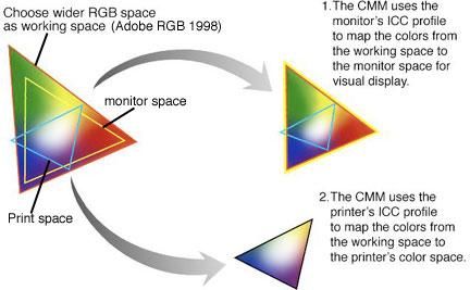
By
choosing an RGB space wider than that of the monitor, you are more likely
to encompass all the colors printable on your printer (blue triangle).
Instead of converting to the monitor's space (yellow triangle) and then
to the printer, which clips colors from the CMYK space, the CMM uses
the monitor's ICC profile, which you create using Adobe Gamma, to map
the colors from your working space to the monitor space so you can edit
the image. The colors retain their relationships to each other, so what
you see is visually similar to the actual colors in your color space.
Then when it is time to print, the larger color space, not the monitor
space, is converted to CMYK by the CMM, using the profile of the printer
you are using. This method is more accurate, and so gives you more control
over the colors in your images.
Problems
begin when images in one RGB working space are converted to another.
Each conversion to a new color space changes the colors. After a few
times, the image becomes severely degraded, especially the greens. When
computers are set up differently, you may try to open your file on another
computer and get the message that there was a profile mismatch. This
means that this computer has a different RGB working space than the
one on which you created your image. Because at Whitehead we all have
many files originating in different places, the best thing to do in
this situation is to choose "Don't convert".
Now
that your images can safely be displayed and saved in Photoshop, you
will begin to see the benefits of this new system in terms of color
matching. First, you need to take a couple minutes to
calibrate your monitor.
Back
to top |


