|
Updated
7/12/05
Scanning and
Resolution
Rotating
The entire canvas
--large adjustment
--subtle adjustment
--measure tool
Rotating a selection
Scaling
Selections
Making
Moving
Copying
Soften edges of
Change shape
Saving
Inverting
Cropping
Touchups
Erasing the Background
Magic Eraser
Background Eraser
Extract Command
Color Channels
(coloring grayscale images)
Tonal and Color Adjustments
Ethics
Grayscale and Line
--Levels
--Curves
--Bright./Contrast
Adjustment Layers
Adjusting Color
--Color Balance
--Hue and Saturation
--Replace Color
Creating a Figure
Combining Images
Aligning Layers
Adding Text
Option Bar
Character Palette
Importing Photoshop
files into other applications
Creating Contact Sheets
Creating a Web Photo Gallery
Save For Web
Printing
ImageReady
|
|
Inside
WI > BaRC
> Graphics
> Photoshop
> Techniques
Photoshop
Techniques
Scanning
and Resolution
Starting
with a good scan is important. The more adjustments you have to make
in Photoshop, the more pixelated the image becomes. If you have questions
about our user room scanners, please see the scanning
pages. If you are unclear about resolution and dpi, see
resolution on the scanning page.
Rotating
.............Back
to top
Rotating
the entire canvas:
Large
Adjustment: Go to Image > Rotate
Canvas. You can choose to rotate 90 degrees, 180 degrees, clockwise
(CW) or counter clockwise (CCW), flip horizontal, or flip vertical.
Subtle
Adjustment: If you finish scanning your
image and you find that it is tilted somewhat or if you scan a gel and
the lanes are a little slanted, you can straighten them in Photoshop
using the Image > rotate canvas command. This technique rotates
the entire page:
Using
the Measure Tool
 , ,
(you will find it underneath the eyedropper) draw a line along an
edge that should be horizontal/vertical line but isn't.
- -The
Info palette will open. You will see the length and the angle of
your line.
- -
Go to the Image > Rotate canvas > Arbitrary window.
Based on the angle value you got in the previous step, Photoshop
automatically calculates how much you will need to rotate the image
to bring your line to an angle of 0 for a horizontal line, or 90
for a vertical line. This value will appear in the angle window.
Clockwise or Counterclockwise will also be selected for you. Click
OK.
- Rotating
a selection:
-
Make
a selection and go to Edit > Free Transform. You can then
click and drag on the transform handles to skew, rotate, or scale.
You can also choose Edit > Transform > Rotate to be able
to rotate the image only.
Scaling
.............Back
to top
(See
resolution
for more detail on this topic)
Go to Image > Image Size. A dialog box will open
where you can choose to alter the dimensions and resolution of your
file. The best option for scaling is to increase the dimensions of the
image by reducing the resolution. To do this, make sure the "resample
image" box is NOT checked, and just change the dimensions as you
like.
However, if this procedure gives you a resolution under 200 ppi, your
image will look blurry when printed. If this is the case, reset the
dialog box by clicking on the option button (the cancel button will
change to reset). The values should go back to the way they were when
you started. This time check the "resample image" box and
put in the dimensions you desire.
If you
don't have any extra resolution to take advantage of, you can scale
an image by choosing "Edit > Free Transform or Edit >
Transform > Scale. By holding shift while placing the cursor
over the corner of the image, you can scale proportionally. Photoshop
resamples the image when you use this method, which can cause some distortion.
Selections
.............Back
to top
To
make a selection, choose the marquee tool
 (You can choose the rectangular shape or the oval shaped marquee) or the
lasso tool
(You can choose the rectangular shape or the oval shaped marquee) or the
lasso tool  .
Click and drag to make a selection. .
Click and drag to make a selection.
To move a selection,
you must choose the move tool  (or hold down the command key to change the selection tool into
the move tool), .
(or hold down the command key to change the selection tool into
the move tool), .
To copy a selection,
choose the move tool and hold down the option key, then click
and drag. (You can also hold down command and option if you have the
selection tool.) If you hold the shift key at the same time, the selection
will move or copy in a straight line. Always click and drag with the
mouse last in this sequence.
To soften the edges of a selection,
choose Select > Feather. You can type in the number of pixels
you want to feather. This will blur the edges of a selection to make
it blend in better.
To
change the shape, size, or rotation of a selection outline
(not what is inside it) choose Select > Transform. When you
have the selection you want, click the selection tool again to apply
the change.
To
save a selection outline,
choose Select
> Save Selection.
This places the selection in a non-color channel or "alpha channel".
You can view it on the channels palette. When you need that selection
again, choose Select
> Load Selection. You can
scroll down the list of selections to find the one you want and click
OK.
To
get the last selection back again
choose Select > Reselect
To
reverse your selection,
choose Select > Inverse. Instead
of selecting what is inside of your selection outline, you will have
selected everything outside it.
Cropping
.............Back
to top
There
are a few choices:
A.
Use the selection tool
to make a selection ,change to the move tool
and choose Image > Crop.
B.
Hold down the mouse
button on the selection tool until the cropping icon appears  .
Draw a box with this tool, reshape as needed, and then hit return to
crop. Cropping will affect all layers of your file. .
Draw a box with this tool, reshape as needed, and then hit return to
crop. Cropping will affect all layers of your file.
C.
Alternatively, you can make a selection with the marquee tool, choose
Select > Inverse and then hit delete. Instead of deleting
what is inside the selection, all surrounding pixels will be deleted.
The advantage to this method is that, unlike cropping, choosing select
inverse only affects the layer you have selected. If you have several
images on separate layers that you want to crop individually, this is
a good method to use.
Touch-ups
.............Back
to top
To clean
up dust and scratches, make small feathered selections near the area
you want to cover using the lasso tool. Use the move tool to copy the
selection (hold the option key) and place it over the blemish. Also
try the rubber stamp tool or the smudge tool.
Erasing
the Background
.............Back
to top
Magic Eraser
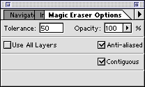
Double
clicking on the magic eraser tool will open the magic eraser options
dialog box. There you can set a tolerance (higher for a more varied
background, lower for a solid background) and an opacity level.
 |
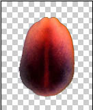 |
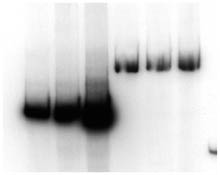
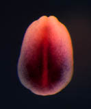
| Before
eraser |
After
eraser |
Background
Eraser  .............Back
to top
.............Back
to top
Double
click on the Background Eraser icon, shown above. This will open the
Background Eraser Options:
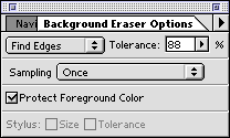
You can
change the tolerance depending on how much variability there is in your
background. If you change the opacity, you can erase to varying degrees
of transparency. Anti-aliased will soften the borders of your selection,
and contiguous will select only areas that touch each other. If you
want to erase a particular color wherever it is in the image, don't
check the box.
 |
 |
 |
| Click
once in the background to select the color that is supposed to
be erased. Then begin erasing. |
The
eraser size is determined by your selection in the Brushes palette.
(Window > Show Brushes)
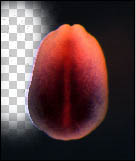
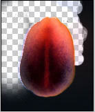
Even if the eraser
touches the foreground image, it will not erase it.... |
unless
the color in the foreground is close to the background color.
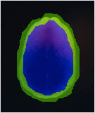
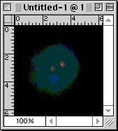
Near the bottom right
of this embryo image, the dark purple color is getting erased. |
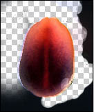
Preventing
foreground erasure:
To prevent
the erasure of foreground as shown in the last frame above, you can
check the box in the Options dialog box (above) marked "Protect
Foreground Color".
Then,
by using the eyedropper tool  ,
you can click on the color you want to protect. The color will then
appear in the toolbox as the foreground color: ,
you can click on the color you want to protect. The color will then
appear in the toolbox as the foreground color:
 |
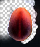 |
| Select
foreground color that you want to protect. |
Now
when you erase, the foreground will not be damaged. |
Extract:
Erasing background without an eraser
Go
to Image > Extract
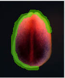 |
 |
 |
| Using
the highlighting tool, draw a line around the edge of the foreground
image so that the line overlaps with both foreground and background.
|
Once
the outline is complete, click with the paint bucket tool in the
center of the image to fill it. |
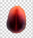
You
can then preview the image and click OK. This is the result, probably
the best of the three erasing options. |
Color
Channels ......
.............Back
to top
It is
often desirable to assign a separate transparent color to each of two
or three images so that when you combine them, you can easily identify
the areas where overlap occurs. The way to do this is to put each image
on its own color channel. The Channel Mixer automates this process,
and makes aligning the images much easier. Here is how to do it:
1.
Open your images. They should be saved as TIFF and the mode should
be set to grayscale. (Go to Image>Mode and choose grayscale
if this is not already the case). If you have only two images to merge,
open a third anyway just as a placeholder.
2.
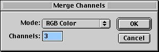
Select one of the images and choose "merge channels"
from the channel palette menu. (Find channel palette under the Windows
menu, and then click on the arrow at the top right of the palette to
see options).
3. Choose
RGB color mode.
4.
Assign a file to each color channel
Click on the scroll bars until the correct file is matched with
the desired channel. If you are using a placeholder for your third file,
assign it the extra color. When you are finished, click OK.
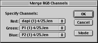
A new
file will be created with your images in separate color channels.
5.
If you are using a placeholder for a third file,
you can now delete it. To do this, select the channel, click with your
move tool in the work area, and choose command-a (or Edit
> Select All). Then click the delete button. The next step is
to fill this area with black, by selecting the entire work area with
that channel selected, going to the Edit menu, and choosing Fill
> with black.
6.
Adjustment: Once your images are combined,
you can select individual channels and use Levels or Curves
adjustments on them to vary the relative brightness or contrast of that
channel. If there is a lot of background noise on a channel, a Levels
adjustment can bring the background back to black. (see
Levels)
Tonal
and Color Adjustments
.............Back
to top
Ethics:
There
are many reasons to adjust images in Photoshop; the most common two
are:
1.
Matching the look of the original. Scanning is imperfect, so you
may have to adjust the image just to make it look like what you started
with.
2.
Increasing the clarity of the image. Increasing contrast or adjusting
colors are methods for making an more readable.
Currently there
are no official guidelines for scientists using Photoshop. As is true
in many stages of the research process, you will
have to use your own judgment to keep your work ethical. Some generally
accepted guidelines to follow are these:
Tonal
and color adjustments are fine if they are applied to an entire
image and not just selective parts of it. However, the use of the
curves adjustment is not recommended for gels, as it increases the
nonlinear relationship of the gray tones, which should ideally be
linear. Levels and Brightness and Contrast are fine.
Removing distractions such as dust that occurs
during scanning or scratches on the film is okay as long as it doesn't
alter data. Any blemishes that occur during the experiment and appear
on the original gel, blot, etc., should not be altered.
Reordering lanes on a gel image is okay as
long as all the lanes remain fixed in reference to markers.
Substituting
or enhancing colors is permitted as long as it doesn't change
the data. For example, if a blue dye is very faint, it may be brightened
in the image ( and in the control ) in Photoshop as long as it isn't
intended to be quantitative.
It
is a good practice to retain a copy of
your original non-adjusted image for reference.
Adjusting
Grayscale and Line Art:
Image > Adjust
You
will get the best results with these adjustments if you keep them subtle.
Repeated dramatic adjustments will eventually make your image look pixelated,
because so much original information is discarded in the process. The
new adjustment layer feature allows you to make minor adjustments of
different kinds and layer them for total effect, without too much pixelation.
Layer
> New Adjustment Layer : Instead of making adjustments to the
pixels of your image, consider making the adjustments on a layer above
your image. This way, if you don't like the way the adjustments look,
you can simply make that layer invisible, or delete it. The adjustments
work the same way as before. You can view your adjustment layers in
the layer palette.
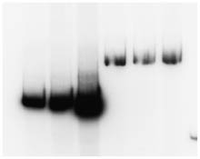
Levels
.............Back
to top
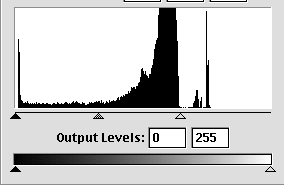
Go to
Image> Adjust > Levels.
This gives you a histogram showing you the
amount of each shade of gray ranging from black to white your image
contains. You can change the range of grays in your image by determining
the beginning and end of this curve.
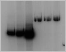
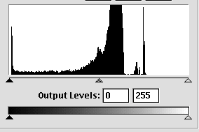
Black
is on the far left, and white on the far right. You can see that the
image above has mostly middle gray tones.
Making
the lights lighter: By moving the lightness slider left to the
edge of the histogram, you can reset the lightest of the middle gray
tones white, which also resets all the values in between.
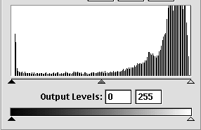
This
is what the histogram looks like for the adjusted image. The histogram
has basically been stretched to span the range from white to black.
The
empty spaces between tones (white lines) indicate that this image
might have been adjusted too radically, and the image might begin
to look pixelated at this point. This is why beginning with a good
image and a good scan is important.
Making
the darks darker: The
dark tones in the example image are dark enough, but if you wanted
to make them darker, you would move the darkness slider on the far
left to the right, to towards the left edge of the curve.
Curves
.............Back
to top
Image >
Adjust > Curves
Note:
There is some question as to whether
this is a legitimate method for adjusting gels, as it increases
the non-linearity of the image.
Curves
also allows you to change the highlights and shadows, but it also
lets you selectively adjust individual midtones in between. Using
the pointer, pull the curve gently concave or convex.
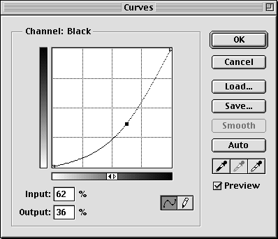
The
grayscale along the bottom of the graph shows which tones you are
affecting. You can change multiple points on the curve. If the preview
box is checked, you can view your changes before they are applied.
Nothing is applied until you click "OK".
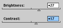
Brightness
and Contrast
Instead
of changing selective tones in an image, this setting affects all
pixels selected. Brightness lightens all pixels, while Contrast pushes
the darker pixels toward black, the lighter pixels toward white, reducing
middle grays. This is not a very sophisticated tool, but it is simple
to use.
Adjustment
layers
.............Back
to top
If you
would like to make an adjustment to an image but keep the original intact,
try using an adjustment layer. This is a special type of layer that
acts a filter over your image and appears in the Layers Palette. If
you don't like it, you can make it invisible or delete it without touching
your original. If you open the file years later and wonder what the
image originally looked like, you can just turn off the adjustment layer
to see the original. Most of the same adjustment tools are available
to use on an adjustment layer. However only 8 bit channels are supported
in this mode.
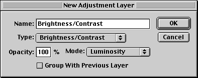
Layer
> New Adjustment Layer
When
you open and adjustment layer, you can give it a name and choose to
group it in the Layers Palette with the image it acts on.
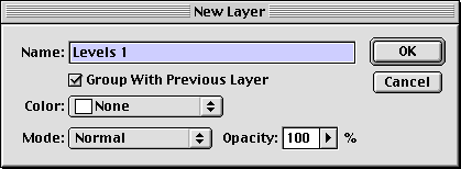
Make
your adjustment as usual.
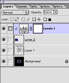
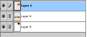
The
example below is what you see in the Layers Palette after you make
the adjustment. As you move layer 2, the layer that has been adjusted,
the levels adjustment moves with it so you don't accidentally lose
it. Click directly on the histogram icon to modify the layers adjustment.
Adjusting
Color:
.............Back
to top
Color
photos benefit from the adjustment tools mentioned above, as well as
a few others relating specifically to color. However, you may notice
color shifts when using the adjustment tools.
Avoiding
color changes:
You
can avoid the extreme color shifts that sometimes occur when adjusting
the contrast of color images by using adjustment
layers to make color adjustments. After choosing the desired
adjustment, Choose Mode > Luminance
in the "New Adjustment Layer" dialog box.
Color
Balance:
.............Back
to top
Image
> Adjust > Color Balance presents
you with sliders for each additive color, Red, Blue and Green.
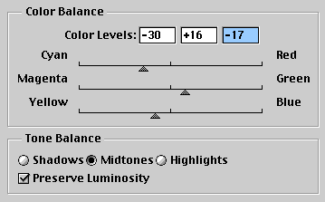
You
can selectively alter the color balance of shadows, midtones or highlights
of an image by moving the sliders to the right to intensify the color,
or to the left to decrease that color in the image. Decreasing one
color increases its opposite. You can play with different combinations
until you are satisfied, and then click OK.
Hue
and Saturation: .............Back
to top
Image
> Adjust > Hue and Saturation. This very useful tool allows
you to change the Hue (color), Saturation (purity or intensity of
the color) and Lightness ( amount of white or black ) of your image.
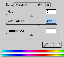
You
can either select "master" which adjusts all the color channels in
an image, or you can choose to change individual color channels.
Replace
Color:
.............Back
to top
Image
> Adjust > Replace Color gives you an eyedropper (different
from the tool palette eyedropper) to select a color from your image,
and replace that color everywhere it is found in the image with another
color of your choosing.
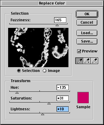
In
the above image, the highlighted areas represent my selection, a certain
shade of green in my image.
The
fuzziness slider was used to make my selection less tightly defined,
increasing the range of green that would fall into my selection.
The
Hue, Saturation, and Lightness sliders were then used to change
that color into a new one (red) to replace the green with.
When
Converting to CMYK makes the image gray:
Select
the grayish background with the eyedropper. The fuzziness slider should
be at or close to zero to prevent making changes within the images.
Look at the selection to make sure it is only affecting the background.
Then move the lightness slider all the way to the right.
Creating
a figure .............Back
to top
Once
you have finished adjusting your images, you may want to combine, arrange
crop, add text or move them into other applications.
Combining
images from different files:
1. First make sure the resolution
and mode are the same in both files. (To check the mode, go to Image
> Mode)
2. Then select the image from one file with the
move tool, and click and drag the image to the new file. A copy will
automatically be made as you drag.
Aligning
your images:
If your
images and text are all on separate layers, you can align them by using
Layer > Align Linked function.
To do this, link all the layers you want to align by clicking the box
to the left of each layer in the layers palette. You will see the linking
symbol. Then go to Layer > Align Linked.
While
the layers are linked, you can also move them as a unit. To unlink them,
click the linking icon to the left of the layer in the layers palette.
Adding
text to images:
You
can add text by choosing the Type Tool  from the tool box. Photoshop places
each new text block on a separate layer. When that layer is selected,
you can move it using the move tool just as you would any other object.
You can also use the arrow keys to make subtle adjustments. This makes
it easier to arrange your figure. Edit the text by clicking on it with
the Type Tool.
from the tool box. Photoshop places
each new text block on a separate layer. When that layer is selected,
you can move it using the move tool just as you would any other object.
You can also use the arrow keys to make subtle adjustments. This makes
it easier to arrange your figure. Edit the text by clicking on it with
the Type Tool.

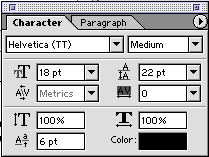
Many
text options are available on the options bar at the top of the screen
when the Type tool is selected, but you can access more options by
clicking on the "palettes" button on the right. This will
open the Character Palette:
You
can also select text add effects such as glowing letters and drop
shadows (Layers > Effects).
Importing
Photoshop files into other applications ............Back
to top
If
you plan to arrange your figure in another program, you will need to
save it in a more universal format. Be aware that Photoshop format is
the only one that supports layers--in all the formats below, layers
will automatically be flattened. This means you should save your original
in case you need to edit it later.
Illustrator
and InDesign: Because these are also
Adobe programs, you can import native Photoshop files (.psd) into
them. No need to save as another format.
FreeHand,
Canvas, or QuarkXPress or other vector
drawing program: save as TIFF. Once
you have a TIFF image, you can open it in your graphics application
using a command such as "place" or "import".
PowerPoint,
Dreamweaver, and web applications: save
as JPEG. Keep in mind that this format is not ideal for print.
For more information about
formats and when to use them, see formats.
Creating
Contact Sheets ............Back
to top
If you find yourself with
a folder full of images, and you can't remember which ones you wanted
to use, this feature might be helpful. It automatically creates thumbnails
of your images using the file names as labels.
1.
Go to File > Automate > Contact Sheet II
2.
Click Choose
to specify the folder containing your images.
3.
Under Document,
specify the dimensions, resolution, and color mode.
4.
Under Thumbnails,
specify layout options for the previews.
5.
Click OK
Web
Image Galleries .............Back
to top
To take
the contact sheet one step further, this option creates a web page with
thumbnail images that you can click on to go to the larger image.
For more
information regarding web page creation and organization, see the Web
Design page.
Web
Optimization .............Back
to top
File
> Save for Web
Original
shows you the image without optimization
Optimized
gives you a preview of your optimized image
2-up lets
you compare side by side
4-up lets
you compare the tradeoffs between file size and detail.
Printing
your images from Photoshop
.............Back
to top
The biggest issue that comes
up with printing is color accuracy. This topic is covered in detail
in Color Management.
Please read this page--you shouldn't use Photoshop without having the
correct color
settings or you could unknowingly do permanent damage to your files.
For information regarding how to print to our color printers, please
visit the Printing page.
ImageReady .............Back
to top
Photoshop now
comes bundled with ImageReady, a software application that can
help you create web pages and optimize images for the web. For tutorials
on how to use ImageReady,
check out this tutorial site:
http://www.tutorialfind.com/tutorials/adobe/imageready/
|